
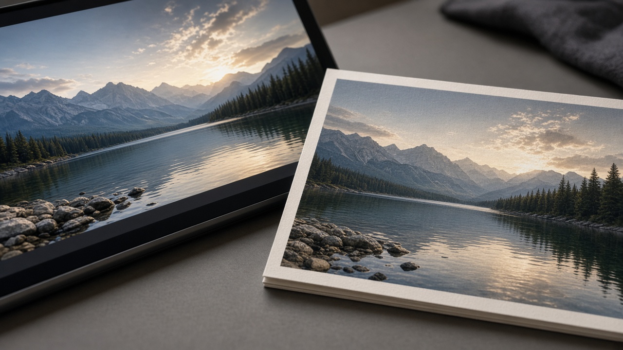
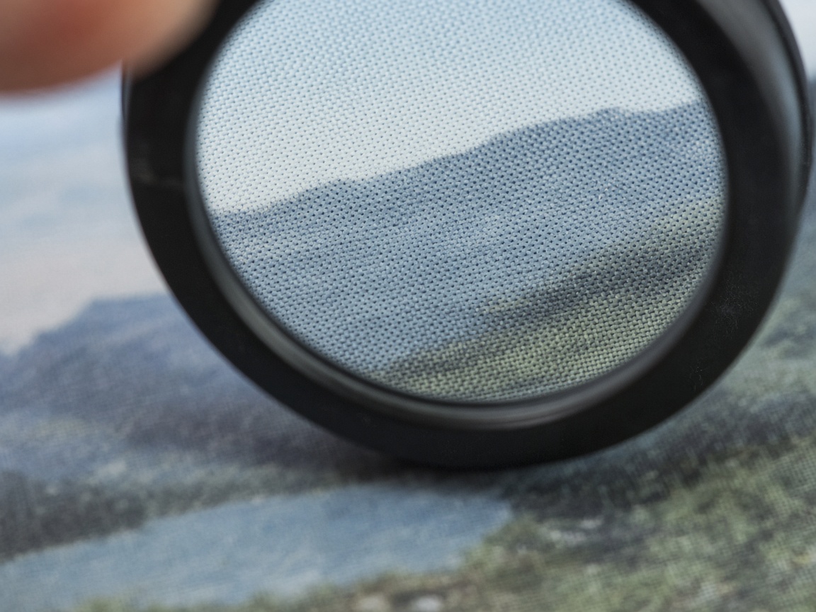
AI images look sharp on a phone and soft on a poster if you skip print basics. This guide walks through a practical SyntVision workflow: choose a usable image, prepare it in the Editor, and export with print in mind — whether you want a small desk print or a larger wall piece.
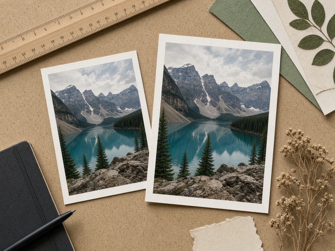
Start with the right source image
Not every Gallery image is ideal for large print. Prefer frames with:
- A clear subject that still reads from a distance
- Enough resolution for your target size (when in doubt, stay modest on print size)
- Clean edges — busy microscopic detail can look muddy on paper
- Colors that are not extremely neon; printers often tame oversaturation
Browse Gallery categories such as landscapes, abstracts, or interiors when you want calmer wall art. For gifts, celebrations categories can work if you crop thoughtfully.
Decide size before you decorate
Write down the physical size (for example 20×30 cm) and orientation. Then crop in SyntVision Editor to that aspect ratio first. Adding text before crop usually forces you to rebuild the layout twice.
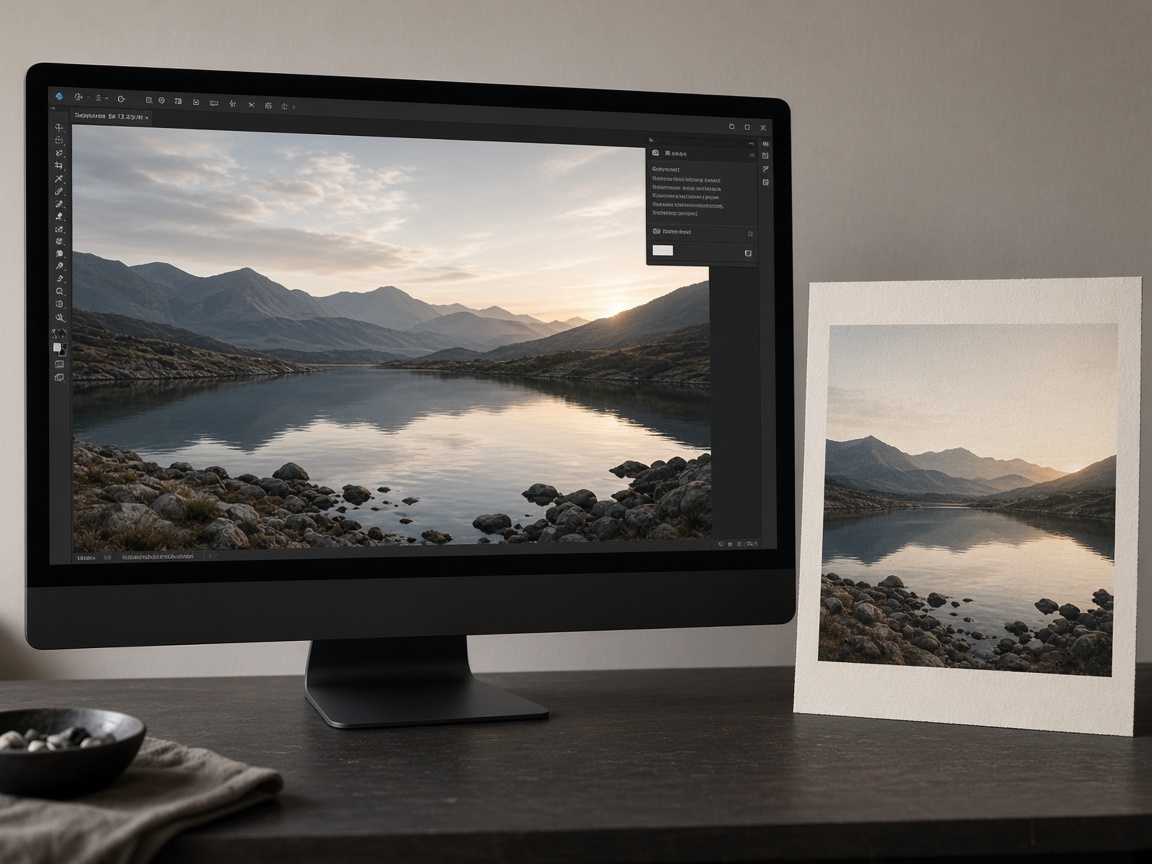
Common aspect ratios:
- 2:3 — many photo prints
- 3:4 — classic frames
- 1:1 — square canvases and albums
- 5:7 — greeting-style prints
Leave a safe margin
Print shops often trim slightly. Keep important faces, logos, and text away from the outer edge. In Editor, imagine a quiet border — if a headline sits on the trim line, move it inward.
Text on print vs text on social
Social graphics can survive bold, thick type. Print rewards restraint: fewer words, higher contrast, and fonts that stay readable at arm’s length. Test by zooming out in the Editor until the canvas looks small — if you cannot read the line, a guest across the room will not either.
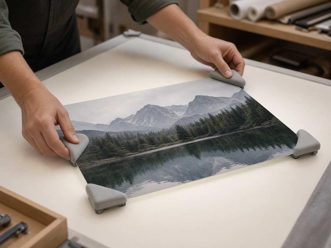
Color and contrast checks
AI generators sometimes push unrealistic saturation. For print:
- Reduce extreme vibrance with gentle adjustments or a softer filter.
- Check that the darkest darks still show a little detail.
- Prefer warm, natural whites over glowing blue-white backgrounds for home interiors.
Upscaling — when it helps
If your Pro plan includes AI upscale (and you have credits), use it when you need a larger file for print and the source looks soft. Upscale after you are happy with crop and composition; upscaling a temporary draft wastes credits. If you are on Free, keep print sizes modest or use a professional print service that accepts the exported resolution you have.
Export checklist
- Final crop matches the frame you will buy
- Text is inside the safe margin
- Filename is clear (
nursery-moon-20x30.jpgbeatsexport-final-final3.jpg) - A private copy is saved to Library
- You re-read the product license if the print is for sale or client delivery
A realistic project path
- Pick a calm Gallery image with space around the subject.
- Open Editor → crop to print ratio.
- Optional: short title or monogram, small and elegant.
- Export and order a small test print before a large canvas.
- Only then scale up the successful version.
Test prints save money. A cheap A4 proof teaches you more than guessing on a 50×70 cm order.
How to use this on SyntVision
Choose a print-friendly image in Gallery, prepare crop and type in the Editor, and archive the master file in Library. Review license notes on the product page before selling prints.
Working with print shops
Ask the shop for bleed requirements, color profile preferences, and the exact pixel dimensions they want. Then reverse-engineer your Editor crop. If they want 300 DPI at 20×30 cm, calculate the pixel target before you upscale. Ordering without numbers is how people receive soft posters.
Bring a calibrated expectation: consumer printers and online canvas services differ. A slightly softer look can still feel premium on textured paper; a crunchy oversharpened file can look cheap. Soft-proof with a small order whenever the project matters emotionally or commercially.
Gift and nursery prints
For nurseries, prefer calmer palettes and simple subjects. Leave negative space so the room does not feel loud. Avoid dense text on the artwork itself — put names on a separate card if needed. Parents often change furniture colors; a flexible image ages better than a trend-heavy mashup.
Lighting and wall color matter more than you think
A print that looked bright in the online proof can disappear on a dark wall or glare on glass. When possible, choose images with a clear midtone structure so they survive imperfect living-room lighting. Matte paper forgives fingerprints; glossy paper intensifies contrast and reflections. Match finish to the room, not only to the image.
For multi-print sets, keep a consistent white balance family across pieces. Mixed temperatures on one wall feel accidental. SyntVision Gallery browsing by mood — cool abstracts versus warm interiors — helps you build a set that belongs together before you spend on frames.
If you add typography for a limited poster drop, lock the layout and print a single proof before the full run. Changing a letter after fifty canvases is an expensive typo.
Shipping and handling realities
Large prints get damaged. Order protective packaging or use a local shop for oversized pieces. Photograph your packed shipment if you sell. These steps are not glamorous and they protect the creative work you already did in the Editor.
Print success is mostly preparation: correct ratio, safe margins, restrained type, and one physical proof. SyntVision gives you the editing surface; the checklist above keeps the paper version honest.
When your proof returns, compare it beside the screen in daylight. Adjust once in the Editor, save as a new Library version, and only then place the larger order.
These extra minutes are the difference between a keepsake and a disappointment you hide in a closet.
Deeper practice notes
Great creative systems are boring on purpose. You repeat a short checklist until it becomes muscle memory: choose with intent, crop for the real placement, add as little decoration as needed, save a master, export a child file, confirm rights, publish, measure one metric, tidy Library. Whenever a step feels glamorous but unclear, return to that checklist.
Most failed projects skip selection. They grab the first colorful thumbnail, then try to invent margins that do not exist. Spend an extra minute in Gallery. The catalog is large enough that a better composition is usually a scroll away. Your Editor time should refine a good choice, not rescue a bad one.
Write the audience and the offer in plain language before you touch type tools. If you cannot say the message in one breath, the image will not say it either. Complexity belongs on the landing page. The creative’s job is recognition and clarity at a glance, especially on mobile data connections and small screens.
When you collaborate, document the product URL, the Library master name, and the export names used in ads or print. That tiny text file prevents legal and operational confusion later. If a platform asks where an asset came from, you answer in seconds instead of reconstructing history from memory.
Finally, protect your future self. Delete failed experiments. Keep masters without burned-in dates when you expect reuse. Review storage monthly. Upgrade plans because of evidence, not anxiety. SyntVision works best as a calm loop — Gallery, Editor, Library, publish — repeated with care.