
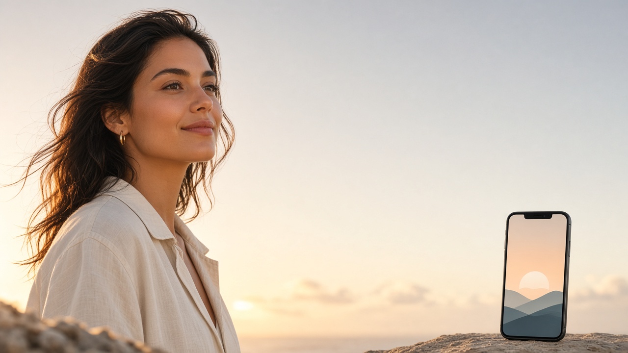
Copy-space images — frames with intentional empty areas — are one of the fastest ways to build ads that still look designed. This guide shows a complete SyntVision workflow: choose the right base, place a short message in the Editor, export for each channel, and avoid the layout mistakes that make AI ads look spammy.

Why copy space converts
Viewers need a place for their eyes to rest and for your words to sit. When a subject points, looks, or leans toward open sky, wall, or table surface, your headline feels invited into the scene instead of pasted on top of a face. That is why pointing and gaze-direction images perform so well in paid social and banners.
SyntVision’s Gallery includes many compositions with usable negative space. Your job is not to fill every pixel. Your job is to use the empty area with discipline.
Step 1 — Select with the headline already in mind
Write the line first, even if it is temporary: “Spring sale this weekend,” “Enrollment open,” “New menu Friday.” Then search Gallery for a frame that has a clear rectangle where those words can live. If the only empty area is a thin strip, keep browsing. Fighting the composition always shows.
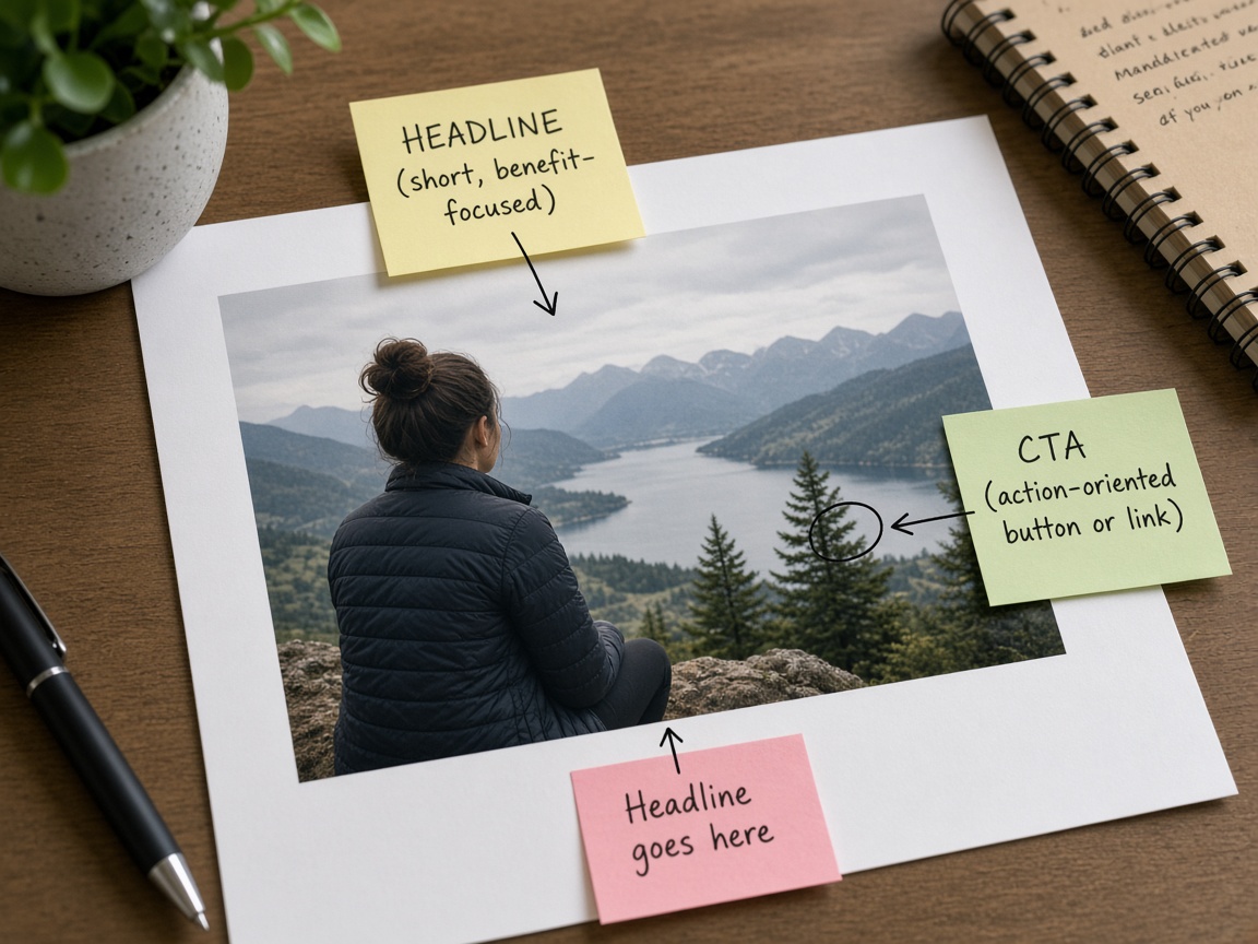
Prefer medium contrast backgrounds behind the future text zone. Pure white can work; busy foliage behind small type usually fails.
Step 2 — Crop for the channel before typing
Open the image in SyntVision Editor and crop for the placement you will buy or post:
- Feed portrait for Instagram/Facebook
- Story/Reel vertical for full-screen mobile
- Wide landscape for website heroes or YouTube
- Square for versatile carousel tiles
One master rarely fits all. Duplicate your Library save when you need a second ratio instead of stretching a single export.
Step 3 — Type like a human, not a billboard factory
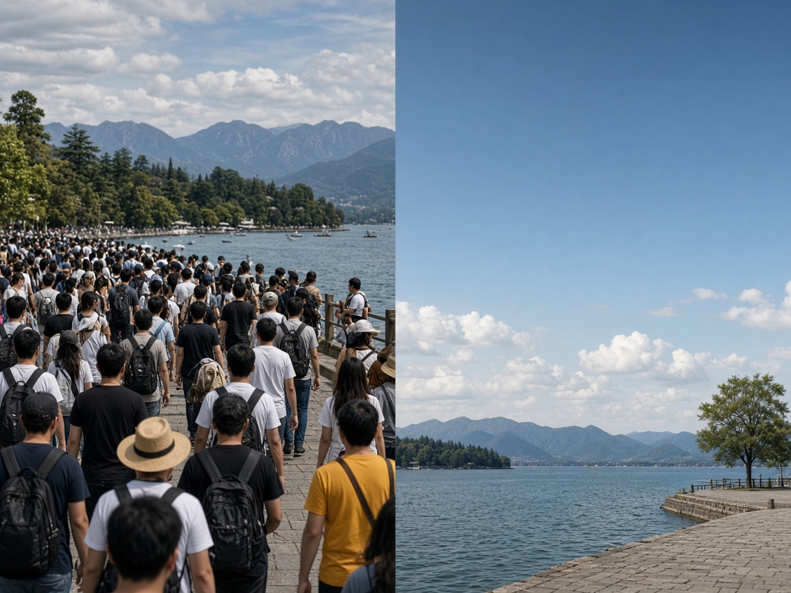
Use one primary line and optional supporting line. If you need a paragraph, you need a landing page, not an ad image. Keep margins generous. High contrast beats fancy script fonts. Brand colors help only when the background still allows readability.
Avoid stacking logos, stickers, giant discounts, urgency clocks, and five hashtags on the same canvas. Crowding is the fastest way to look low quality — the exact signal you do not want for users or ad reviewers.
Step 4 — Export and name for reuse
Export the channel-specific file, then keep a cleaner master in Library without the promo date so you can reuse the visual next month with new copy. Name files with campaign and size: spring25-story-pointing.jpg.
Step 5 — Confirm license for ads
Paid ads are commercial use. Read the product license on the Gallery page before launching. Redistributing the original file as stock is not the same as using it inside your ad creative. When unsure, ask via Contact.
Quality checklist before you spend media budget
- Headline readable at phone size
- Face or product not covered by type
- Safe margins from edges
- One clear call to action idea (even if the CTA button lives in the ad UI)
- License checked
- Separate exports for each ratio you will run
Creative variations that stay on-brand
Once the first ad works, change one variable at a time: headline wording, background image, or color accent. If you change everything, you learn nothing. Library masters make orderly testing possible.
How to use this on SyntVision
Find copy-space friendly images in Gallery, design in the Editor, store masters in Library, and re-check licenses before boosting posts.
Keep experimenting with small, finished campaigns rather than endless drafts. Finished ads teach faster and keep your Library full of reusable starting points.
For deeper basics, also read our guides on Free vs Pro and commercial licensing so tooling and rights stay aligned with your media spend.
When a composition almost works, resist the urge to shrink text to microscopic size. Choose another Gallery image. The catalog is large for a reason — match the frame to the message instead of punishing the viewer.
Finally, after the campaign ends, archive the winning export and delete obvious fails. Storage hygiene is part of creative professionalism, especially on Free plans with smaller Library limits.
Deeper practice notes
Great creative systems are boring on purpose. You repeat a short checklist until it becomes muscle memory: choose with intent, crop for the real placement, add as little decoration as needed, save a master, export a child file, confirm rights, publish, measure one metric, tidy Library. Whenever a step feels glamorous but unclear, return to that checklist.
Most failed projects skip selection. They grab the first colorful thumbnail, then try to invent margins that do not exist. Spend an extra minute in Gallery. The catalog is large enough that a better composition is usually a scroll away. Your Editor time should refine a good choice, not rescue a bad one.
Write the audience and the offer in plain language before you touch type tools. If you cannot say the message in one breath, the image will not say it either. Complexity belongs on the landing page. The creative’s job is recognition and clarity at a glance, especially on mobile data connections and small screens.
When you collaborate, document the product URL, the Library master name, and the export names used in ads or print. That tiny text file prevents legal and operational confusion later. If a platform asks where an asset came from, you answer in seconds instead of reconstructing history from memory.
Finally, protect your future self. Delete failed experiments. Keep masters without burned-in dates when you expect reuse. Review storage monthly. Upgrade plans because of evidence, not anxiety. SyntVision works best as a calm loop — Gallery, Editor, Library, publish — repeated with care.
Ad examples you can imitate ethically
Example A: a person pointing toward open wall space with a five-word weekend offer. Example B: a calm tabletop scene with a product silhouette and a single price line. Example C: a seasonal background with a name and date only. Notice what these share: one idea, readable type, respectful margins, and a composition that already wanted text. Imitate structure, not stolen brand slogans.
Build a personal swipe file inside Library — your own winners, not random internet screenshots with unclear rights. When a client asks for “something like last time,” you will have a legal, organized answer.